Comparisons to dynesty#
This notebook contains code to reproduce Figure 6, 7, and 8 from the paper which compare results
the results obtained with dynesty and pocomc when analyzing the 100 binary black hole signals
use for the P-P tests.
Imports#
We import that various modules that we’ll use.
import numpy as np
import h5py
from pathlib import Path
import pandas as pd
import matplotlib.pyplot as plt

from gw_smc_utils.plotting import set_style, lighten_colour

set_style()
Data release path#
We define the path to the data release and to the summary file that contains the run statistics used to make these plots.
data_release_path = Path("../data_release/gw_smc_data_release_core/")
summary_file = (
    data_release_path / "simulated_data" / "pp_tests" / "pp_test_results_summary.hdf5"
)
Injections and SNRs#
We also load the injections so that we can compute the SNRs on injections.
injections = pd.read_hdf(
    "../data_release/gw_smc_data_release_core/simulated_data/pp_tests/pp_test_injection_file.hdf5",
    "injections",
)
n_injections = len(injections)
Compute the network SNR
network_snr_3det = injections["network_snr"]
network_snr_2det = np.sqrt(injections["H1_snr"] ** 2 + injections["L1_snr"] ** 2)
We plot the SNR, this plot is not shown in the paper but highlights how the a large fraction of the signals have SNRs at or below 8.
plt.hist(network_snr_2det, bins=32, label="2", histtype="step", color="C0")
plt.hist(network_snr_3det, bins=32, label="3", histtype="step", color="C1")
plt.legend(title="\# detectors")
plt.xlabel("Network SNR")
plt.axvline(8, ls="--", color="k")
plt.text(8, 33, "SNR 8", rotation=0)
plt.show()

print("Median 3-detector network SNR: ", np.median(network_snr_3det))
print("Median 2-detector network SNR: ", np.median(network_snr_2det))
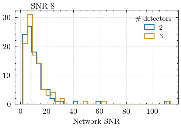
Median 3-detector network SNR:  8.719605728073859
Median 2-detector network SNR:  8.07498202669781
Loading the data and configuring the plots#
We then load the statistics from the summary file into a dictionary which contains another dictionary with results for each sampler.
data = {}
with h5py.File(summary_file, "r") as f:
    for sampler in f.keys():
        data[sampler] = {}
        for ndetector in f[sampler].keys():
            data[sampler][ndetector] = {}
            for key in f[sampler][ndetector].keys():
                data[sampler][ndetector][key] = f[sampler][ndetector][key][:]
We define the colours to be used for each sampler
colours = {
    "pocomc": "C0",
    "dynesty": "C1",
}
Figure 6 - Log-evidence#
This figure shows the difference in the log-evidences reported by both samplers
figsize = plt.rcParams["figure.figsize"].copy()
figsize[1] = 2.3 * figsize[1]
fig, axs = plt.subplots(3, 1, figsize=figsize)

# Compute the various quantities of interest
diff_2det = (
    data["dynesty"]["2det"]["log_evidence"] - data["pocomc"]["2det"]["log_evidence"]
)
diff_3det = (
    data["dynesty"]["3det"]["log_evidence"] - data["pocomc"]["3det"]["log_evidence"]
)

relative_diff_2det = (
    data["dynesty"]["2det"]["log_evidence"] - data["pocomc"]["2det"]["log_evidence"]
) / np.abs(data["dynesty"]["2det"]["log_evidence"])
relative_diff_3det = (
    data["dynesty"]["3det"]["log_evidence"] - data["pocomc"]["3det"]["log_evidence"]
) / np.abs(data["dynesty"]["3det"]["log_evidence"])

error_diff_2det = (
    data["dynesty"]["2det"]["log_evidence_error"]
    - data["pocomc"]["2det"]["log_evidence_error"]
)
error_diff_3det = (
    data["dynesty"]["3det"]["log_evidence_error"]
    - data["pocomc"]["3det"]["log_evidence_error"]
)

# Plot the differences
axs[0].hist(
    diff_2det, bins=20, histtype="step", label="2", color=lighten_colour("k", 0.5)
)
axs[0].hist(diff_3det, bins=20, histtype="step", label="3", color="k")

axs[0].set_xlabel(r"$\Delta\ln Z$")
axs[0].set_ylabel("Count")

axs[1].hist(
    relative_diff_2det,
    bins=20,
    histtype="step",
    label="2",
    color=lighten_colour("k", 0.5),
)
axs[1].hist(relative_diff_3det, bins=20, histtype="step", label="3", color="k")

axs[1].set_xlabel(r"$\Delta \ln Z / \ln Z_{\texttt{dynesty}}$")
axs[1].set_ylabel("Count")

axs[2].hist(
    error_diff_2det, bins=20, histtype="step", label="2", color=lighten_colour("k", 0.5)
)
axs[2].hist(error_diff_3det, bins=20, histtype="step", label="3", color="k")
axs[2].set_xlabel(r"$\Delta \sigma[\ln Z]$")
axs[2].set_ylabel("Count")

axs[0].legend(title="\# detectors", loc="upper right")
plt.tight_layout()

fig.savefig("figures/log_evidence_differences.pdf", bbox_inches="tight")
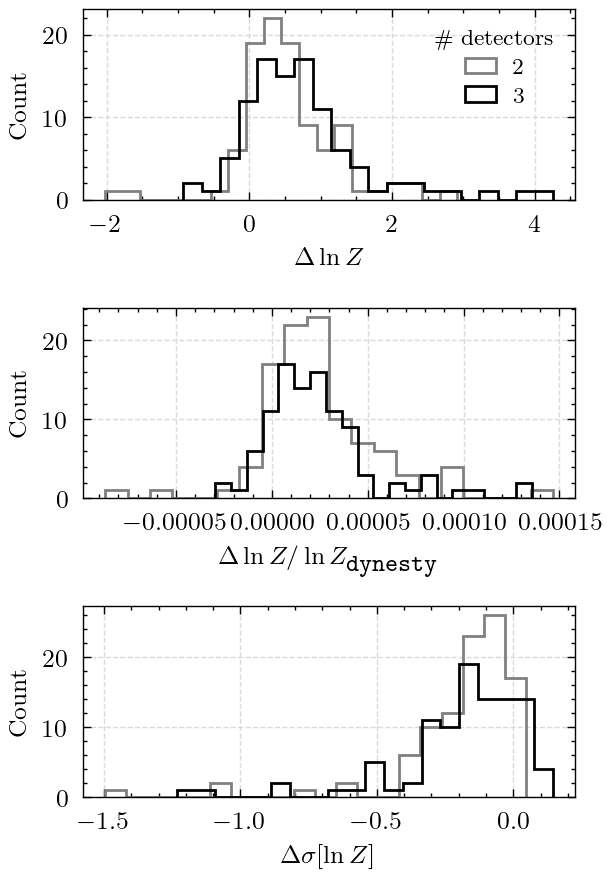
Figure 7 - Number of Posterior Samples#
This figure shows the number independent and identically distributed (i.i.d) samples produced by each sampler.
figsize = plt.rcParams["figure.figsize"].copy()
figsize[1] = 1.2 * figsize[1]
fig = plt.figure(figsize=figsize)

detector_ls = {
    "3det": {"ls": "-"},
    "2det": {"ls": "--"},
}
hist_kwargs = dict(
    bins=10,
    histtype="step",
)

labels = {
    "3det": "3 detectors",
    "2det": "2 detectors",
    "pocomc": r"\texttt{pocomc}",
    "dynesty": r"\texttt{dynesty}",
}


for sampler, det_data in data.items():
    for det, vals in det_data.items():
        colour = colours[sampler]
        if det == "2det":
            colour = lighten_colour(colour, 0.5)
        plt.hist(
            vals["n_samples"],
            label=f"{labels[sampler]} - {labels[det]}",
            color=colour,
            **detector_ls[det],
            **hist_kwargs,
        )
legend = plt.legend(
    frameon=True, framealpha=1.0, fancybox=False, loc="upper right", fontsize=7
)
legend.get_frame().set_linewidth(0.5)
plt.xlabel("I.I.D. samples")
plt.ylabel("Count")
plt.tight_layout()
fig.savefig("figures/n_samples.pdf", bbox_inches="tight")
plt.show()
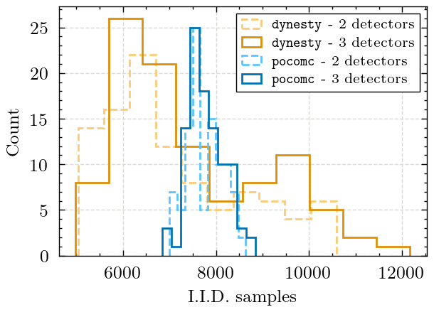
Compute the average number of posterior samples for pocomc
for sampler in data.keys():
    counts = []
    for vals in data[sampler].values():
        counts.append(vals["n_samples"])
    counts = np.array(counts).flatten()
    mean_counts = np.mean(counts)
    print(f"Mean counts for {sampler}: {mean_counts}")
Mean counts for dynesty: 7286.8
Mean counts for pocomc: 7764.95
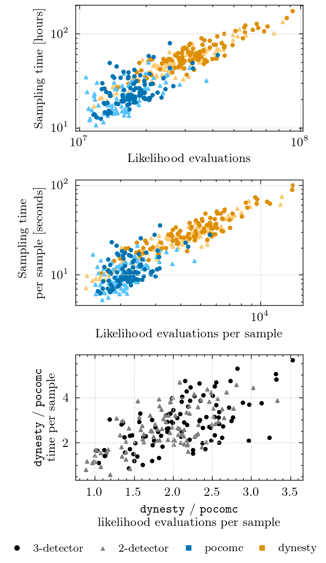
Figure 8 - Likelihood Evaluations & Sampling Time#
Here, we compare the number of likelihood evaluations and sampling time for both samplers.
We also include the statistics per samples since the samplers do not produce the same number of samples.
figsize = plt.rcParams["figure.figsize"].copy()
figsize[1] = 2.8 * figsize[1]
fig, axs = plt.subplots(3, 1, figsize=figsize)

marker_kwargs = {
    "3det": dict(marker="o", s=5),
    "2det": dict(marker="^", s=5),
}
for sampler, det_data in data.items():
    for det, vals in det_data.items():
        colour = colours[sampler]
        if det == "2det":
            colour = lighten_colour(colour, 0.5)
        axs[0].scatter(
            vals["likelihood_evaluations"],
            vals["sampling_time"] / 3600,
            label=f"{sampler} {det}",
            color=colour,
            **marker_kwargs[det],
        )

        axs[1].scatter(
            vals["likelihood_evaluations"] / vals["n_samples"],
            vals["sampling_time"] / vals["n_samples"],
            label=f"{sampler} {det}",
            color=colour,
            **marker_kwargs[det],
        )

axs[0].set_xlabel("Likelihood evaluations")
axs[0].set_ylabel("Sampling time [hours]")
axs[0].set_xscale("log")
axs[0].set_yscale("log")

axs[1].set_xlabel(r"Likelihood evaluations per sample")
axs[1].set_ylabel(r"Sampling time\\per sample [seconds]")
axs[1].set_xscale("log")
axs[1].set_yscale("log")

for det in ["3det", "2det"]:
    dynesty_evals_weighted = (
        data["dynesty"][det]["likelihood_evaluations"]
        / data["dynesty"][det]["n_samples"]
    )
    pocomc_evals_weighted = (
        data["pocomc"][det]["likelihood_evaluations"] / data["pocomc"][det]["n_samples"]
    )
    dynesty_time_weighted = (
        data["dynesty"][det]["sampling_time"] / data["dynesty"][det]["n_samples"]
    )
    pocomc_time_weighted = (
        data["pocomc"][det]["sampling_time"] / data["pocomc"][det]["n_samples"]
    )

    colour = "black"
    if det == "2det":
        colour = lighten_colour(colour, 0.5)
    axs[2].scatter(
        dynesty_evals_weighted / pocomc_evals_weighted,
        dynesty_time_weighted / pocomc_time_weighted,
        color=colour,
        **marker_kwargs[det],
    )

    print(
        f"{det} mean ratio (evals): {np.nanmean(dynesty_evals_weighted / pocomc_evals_weighted):.2f} +/- {np.nanstd(dynesty_evals_weighted / pocomc_evals_weighted):.2f}"
    )
    print(
        f"{det} mean ratio (time): {np.nanmean(dynesty_time_weighted / pocomc_time_weighted):.2f} +/- {np.nanstd(dynesty_time_weighted / pocomc_time_weighted):.2f}"
    )

axs[2].set_xlabel(
    r"\texttt{dynesty} / \texttt{pocomc}" + "\nlikelihood evaluations per sample",
    multialignment="center",
)
axs[2].set_ylabel(
    r"\texttt{dynesty} / \texttt{pocomc}" + "\ntime per sample", multialignment="center"
)

# Manually add a legend
legend_handles = [
    plt.Line2D(
        [0],
        [0],
        marker="o",
        color="w",
        label="3-detector",
        markerfacecolor="k",
        markersize=5,
    ),
    plt.Line2D(
        [0],
        [0],
        marker="^",
        color="w",
        label="2-detector",
        markerfacecolor=lighten_colour("k", 0.5),
        markersize=5,
    ),
    plt.Line2D(
        [0],
        [0],
        marker="s",
        color="w",
        label="pocomc",
        markerfacecolor="C0",
        markersize=5,
    ),
    plt.Line2D(
        [0],
        [0],
        marker="s",
        color="w",
        label="dynesty",
        markerfacecolor="C1",
        markersize=5,
    ),
]
fig.legend(handles=legend_handles, loc="center", bbox_to_anchor=(0.5, -0.01), ncol=4)

plt.tight_layout()

fig.savefig("figures/sampling_time_vs_likelihood_evaluations.pdf", bbox_inches="tight")
plt.show()
3det mean ratio (evals): 2.09 +/- 0.56
3det mean ratio (time): 2.84 +/- 1.04
2det mean ratio (evals): 1.92 +/- 0.51
2det mean ratio (time): 2.63 +/- 0.93